Introduction: What’s New in iOS 26 Beta 2?
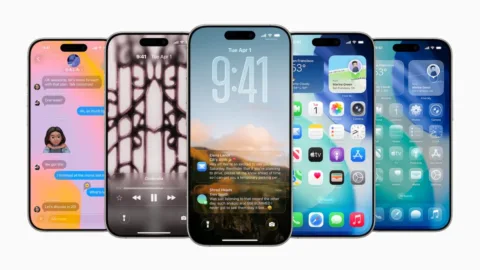
With the release of iOS 26 Beta 2, Apple is doubling down on user experience improvements—particularly focusing on refining Liquid Glass, its bold new design language for iPhone, iPad, and other Apple devices. Originally unveiled at WWDC 2025, the Liquid Glass UI marks a significant evolution in Apple’s visual approach, but it hasn’t been without criticism.
Apple’s latest beta rollout attempts to fix early usability issues while also introducing a suite of new features aimed at improving personalization, accessibility, and functionality.
Understanding the Liquid Glass Interface
The Liquid Glass design system draws inspiration from the physical properties of glass—such as light refraction, translucency, and depth—to deliver a more fluid, layered user experience. It adds elegance and modernity to iOS, but this shift also introduces challenges around readability and usability, especially in dynamic interface layers like Control Center and notifications.
User Feedback and Early Concerns
Shortly after the developer beta dropped, users began sharing screenshots highlighting the readability issues caused by Liquid Glass. On platforms like Twitter/X, testers noted that the see-through interface made it difficult to distinguish UI elements from the Home Screen background.
A major issue revolved around the Control Center, where the semi-transparent glass aesthetic clashed with underlying app icons, making buttons and sliders nearly unreadable.
“iOS 26 looks sleek, but users want control—let us customize Control Center layout and adjust blur/transparency levels. Not everyone wants a frosted-glass overload.” — @craigmlambo22
Key Fixes in Beta 2
Apple has shown a strong willingness to incorporate feedback quickly, as demonstrated in Beta 2 of iOS 26, released on Monday.
Control Center Improvements
The most notable fix involves adjusting the background blur in Control Center, now better obscuring Home Screen elements to improve contrast. This makes sliders, toggles, and buttons significantly more legible.
Notification Readability
Another area that received attention is the notifications system. Although still evolving, notifications are now slightly sharper, improving legibility on both light and bright backgrounds. Apple may continue to fine-tune these elements as the final release approaches.
Other New Features in iOS 26 Beta 2
Beyond visual polish, Beta 2 introduces several new features that enhance daily usability across Apple’s ecosystem.
Accessibility Enhancements
Apple has added a dedicated Accessibility section to App Store product pages, allowing developers to highlight features like VoiceOver support, dynamic type, and haptic feedback. This aligns with Apple’s long-term mission of inclusive design.
iCloud Sync and Journaling
The Journaling app, a standout feature announced at WWDC, now supports iCloud sync on iPads, bringing seamless cross-device continuity to Apple’s wellness ecosystem.
Apple Wallet and Apple Music Updates
Apple Wallet now features order tracking capabilities, giving users a real-time overview of package deliveries.
A new Apple Music Radio widget lets users pin live radio stations to their Home Screen, enhancing discovery and playback convenience.
What This Means for Users and Developers
Apple’s responsiveness in Beta 2 reflects a growing trend in software development: iterative design based on real-time feedback. For developers, this underscores the importance of beta testing and community engagement.
For users, these changes reaffirm Apple’s commitment to balancing aesthetics with function. However, as many testers have pointed out, the lack of customization options—particularly in the Control Center—remains a pain point.
The Bigger Picture: Trenzest’s Take on UX and Apple’s Strategy
At Trenzest, we believe that Apple’s move toward an immersive, translucent interface like Liquid Glass signals a broader shift in UI/UX trends—toward design systems that evoke emotion, depth, and tactility. But with great beauty must come user control.
Tech-savvy audiences, marketers, and creators alike should watch closely: Apple’s blend of aesthetics and function is powerful, but only when personalization is prioritized. Brands and app developers can learn from Apple’s missteps and feedback loop—your users are the best design critics.
Conclusion: A Promising Start with Room to Grow
iOS 26 Beta 2 is a testament to Apple’s iterative approach to product refinement. While the Liquid Glass UI is an ambitious step forward, it still requires fine-tuning in readability and customization. The improvements to Control Center and notifications are welcome, but users are still asking for greater personalization.
As we move toward the public release in the fall, we expect continued updates—both visual and functional—that align with user needs and preferences.
At Trenzest, we’ll continue tracking these developments and providing actionable insights for digital professionals and creators. Whether you’re designing your own product or just exploring tech trends, stay tuned for more updates and strategies to keep you ahead of the curve.